As part of your research, you toured the former TWA terminal and visited Eero Saarinen’s archives at Yale University. How did that inform what came next?
Michael Bierut: I remember going to the terminal and just being really impressed with how consistent the use of this idiosyncratic typeface was onsite already. In the bathroom, there was a sign labeling the paper towels that was there from the grand opening [in 1962].
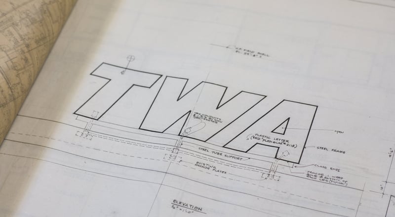
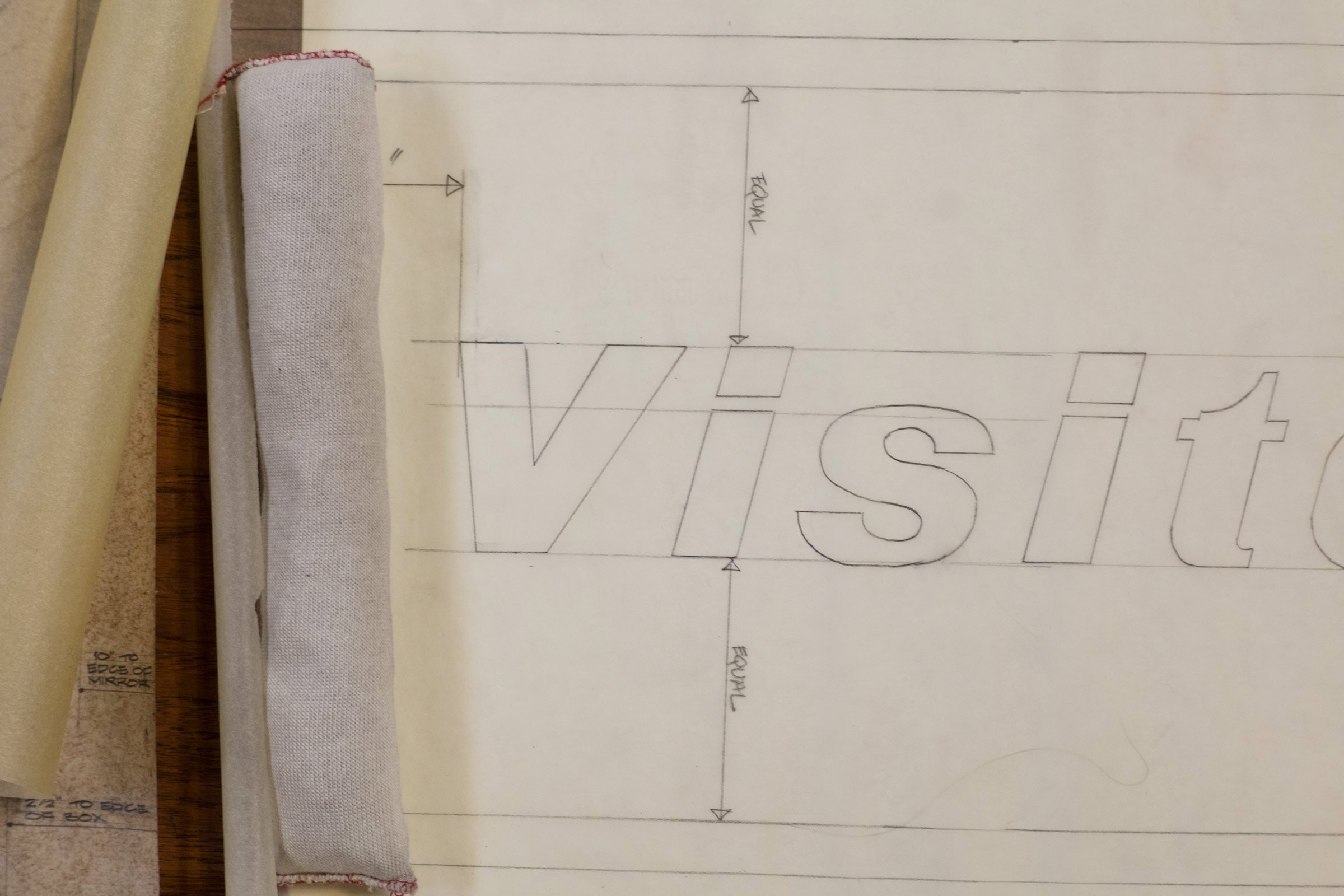
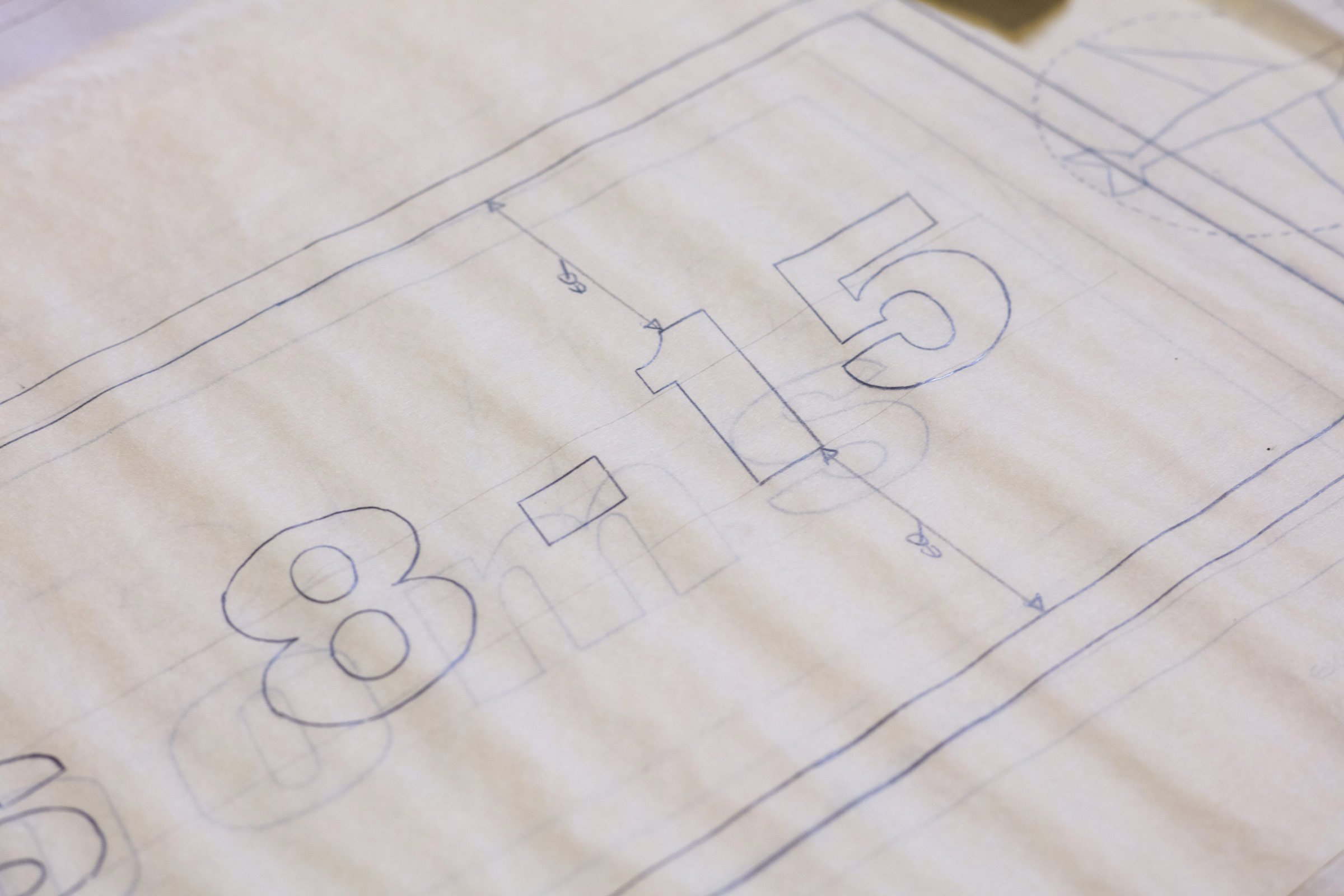
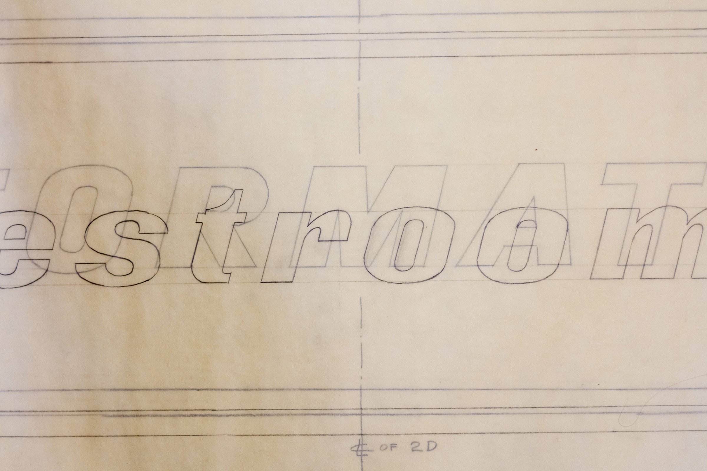
At Yale, we isolated all the papers that talked about the signage, that showed Saarinen's team's original drawings of that font. In those drawings, the type was done by hand, really precisely. This all goes back to a day when regular people would have no idea what the names of typefaces were, that they had different names, where to get them, how to specify them. Printers knew where fonts came from, but sign makers basically would have to make them by hand. So whoever was doing this work in Saarinen's office had to painstakingly lay out every sign, and then that, in turn, would go to the fabricator, who would cut the letters out of metal.
What did the hand-drawn font in Saarinen's papers look like?
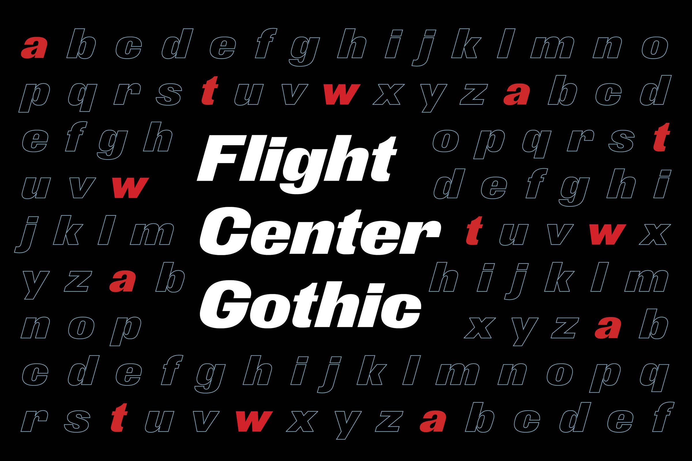
MB: It looked like a typeface called Derek, which is actually much older than you think it is. It dates from like the late 19th century, even though it looks very modern. I think the appeal to Saarinen and his team was that it looks very kind of Jet Age. We all know what an italic typeface looks like, but that one really leans forward. It looks like it's going 1,000 miles an hour. And very bold, very plain, chosen to go with the way that the letters TWA appeared on the planes and on the Flight Center at the time. There was no contemporary version of it that we could find that matched those drawings.
So you began creating an original typeface based on those drawings. What were the challenges of that?
MB: Interestingly enough, because those drawings were all done by hand, we found that there were variations between letters on different signs. So one decision we had to work out was: If there are three different ways that we found that an R was drawn on various signs … which R are we going to use or are we going come up with a new one that sort of splits the difference? Along the way, we pulled in an expert collaborator named Nick Sherman, who ended up being the guy who did the final digitized drawings of all the letters and optimized them for different sizes.
How do you think Flight Center Gothic fits in with the history of the TWA terminal?
MB: If you're out at the terminal, what you will see is as close as possible to what it would have looked like if someone was doing the signs and graphics back then. That's how we want it to look now, just like that, just as perfect — and even better because it's good as new.
